Concept homepages
Version 1Three directions, each with its own design system. All three are built mobile first, because a call about a dead power point or a solar quote starts on a phone far more often than it starts on a desktop.
 Direction one
Flagship
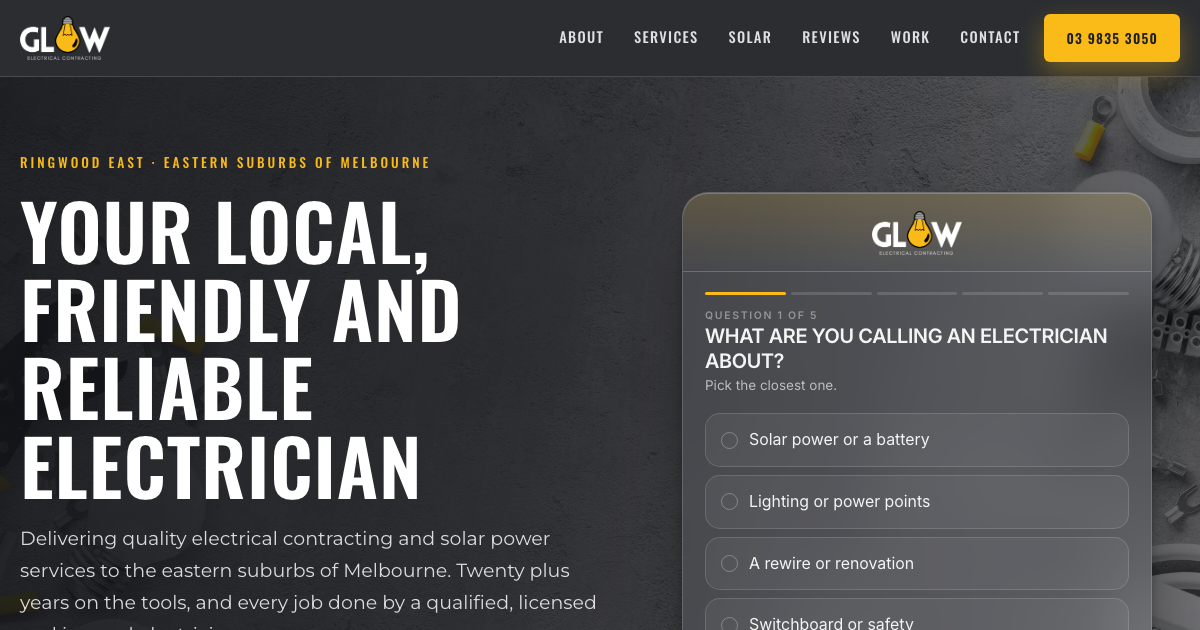
The confident, faithful version of Glow. Your own Oswald and Montserrat, your gold on charcoal, your hero photograph and your accreditation badges up front. Six services laid out properly instead of a wall of text, your three reviews given room, and the empty gallery turned into a labelled slot ready for real photos.
Open concept one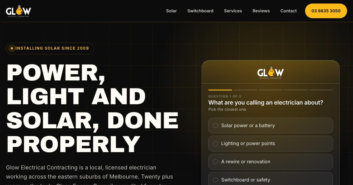 Direction two
Switched on
Gold and black played hard, with two live tools doing the selling. A solar explorer that turns four taps into the size band you would start a design from, and a switchboard checker that tells somebody what is behind that little door. Built to make you the person who explains things, which is exactly what Phillip's review says you are.
Open concept two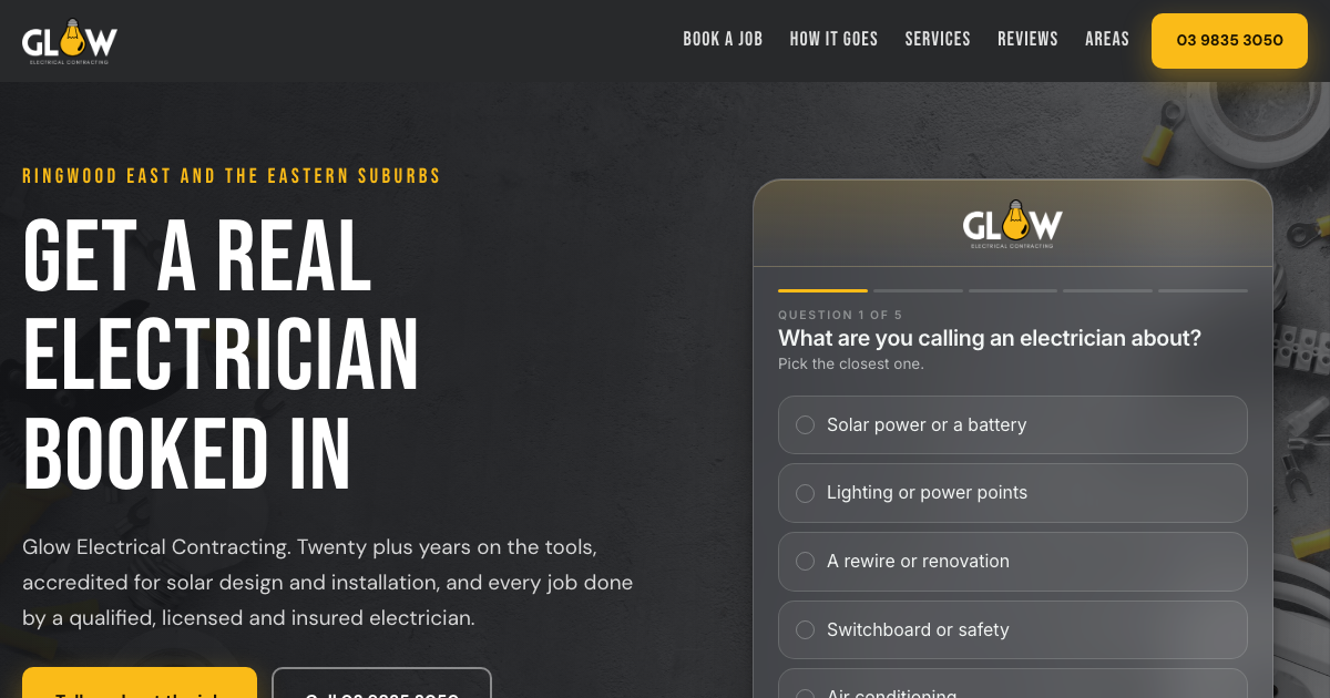 Direction three
Booked in
The conversion build. Everything points at one thing, getting the job booked. A five step request that asks what you ask on the phone, then writes the summary back, so an enquiry lands already qualified. Made for a thumb, and far more likely to be finished than a blank contact form.
Open concept threeYour new brand, direction four
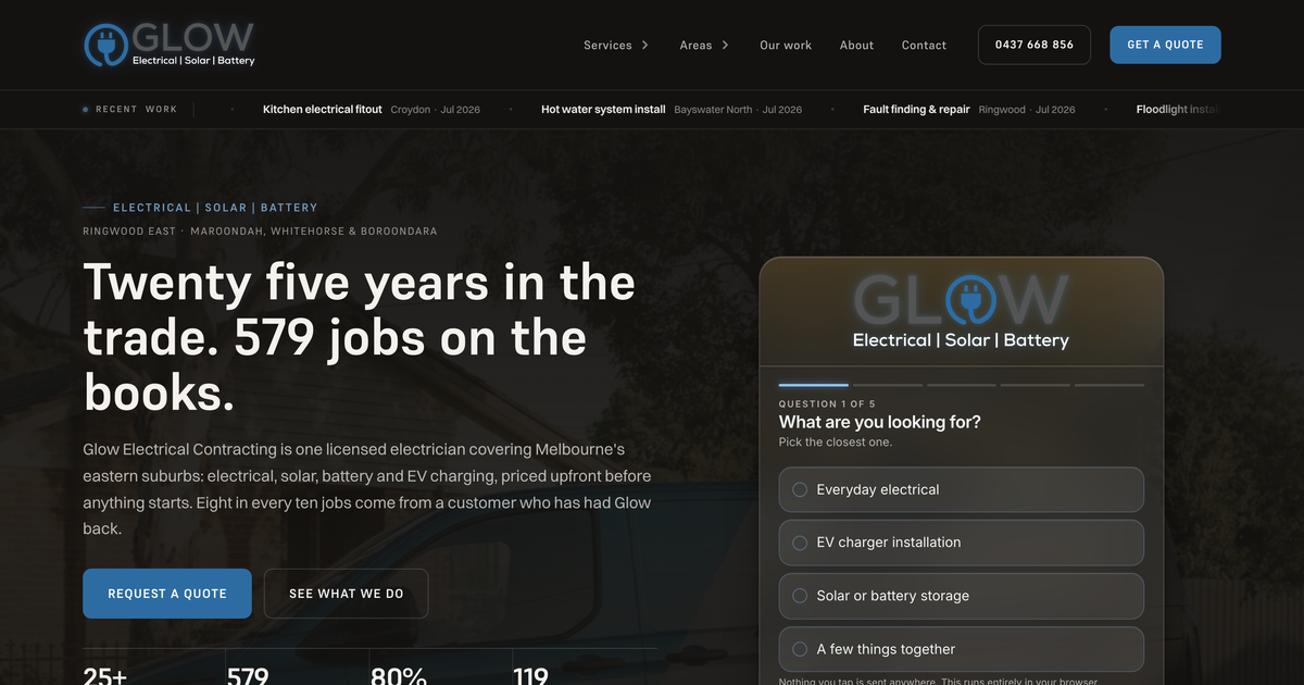
Added 18 AugBuilt from the brand new GLOW identity you submitted on 13 August, not the old gold logo the first three directions were built on. Dark, minimal and technically confident, in your own words: sharp, trusted, current. Updated 18 August into a full multi-page site: six dedicated service pages, eleven suburb pages across Maroondah, Whitehorse and Boroondara, a real work gallery pulled from your own ServiceM8 job records, and a chat widget wired to your own GoHighLevel account, set to Supreme and Switzer, two typefaces chosen by matching letterforms against your own logo rather than a default set.