Worth knowing before you look
A few things turned up while these were being built that are worth five minutes of the call, because they cost you work right now.
- You are running three different logos. The crew sunburst mark sits in your website header, a completely different green tree wordmark is your favicon and watermarks every photo, and a third bright green and black look runs on your Instagram flyer. Each is good. Three at once means nobody recognises you twice.
- Every service photo on your site is stock. Twenty photographs of other people's gardens, each with the green wordmark stamped on it. Meanwhile you have fifty two real job photos sitting on Instagram. All three concepts below use the real ones.
- Your Work Gallery page has no gallery on it. The one page a buyer opens to decide whether you are any good serves nothing but your logo.
- Your five star rating is nowhere on your homepage. Twenty Google reviews, nineteen of them five stars, and a buyer landing on your site cannot see that.
- Your site says Melbourne, your business is northern Melbourne. You are competing against every mower in the city for a word you cannot win, when you own a twenty five kilometre patch out of Lalor with sixty named suburbs in it.
- Your hours disagree with themselves. The website says 7am to 5pm Monday to Saturday. Google says 7am to 7pm Monday to Saturday and 9am to 5pm Sunday. Whichever is right, the other is turning people away.
The three logos you are running
All three are real and all three are currently in use. Concept 1 backs the crew mark, concept 2 backs the tree wordmark, concept 3 backs the Instagram look. Picking one is probably the most valuable decision on this page.
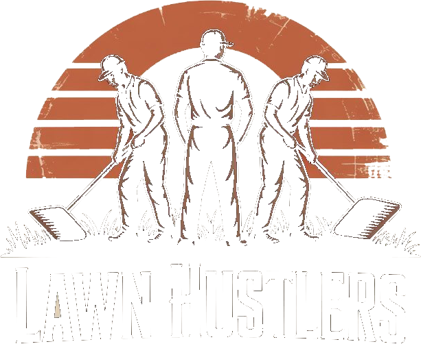
The crew markSits in your website header. Three workers, a terracotta sunburst, heavy condensed type. The most distinctive of the three.

The tree wordmarkYour favicon, and the watermark on every photo on your site. Friendlier, greener, and completely unrelated to the mark above it.
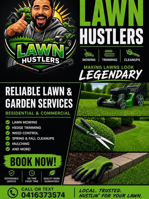
The Instagram lookBright green on black, and the source of the two best lines you have written: making lawns look legendary, and local, trusted, hustlin' for your lawn.
The colours, pulled from your own files
Nothing here was chosen. The green and the brown are declared in your website's own stylesheet, the terracotta is measured out of your header logo, and the near black is the silhouettes in that same file.
The three directions
Version 1 · 16 August 2026Same business, same facts, same photos. Three different arguments for why someone should ring you.
 Concept 1 · The proof
Let the work do the talking
Built on your crew sunburst logo, in near black and terracotta. It leads with the five star rating and the real job photos, and fixes the empty gallery problem outright.
- Your real work, six jobs, front and centre
- Four real Google reviews, quoted and credited
- All sixty suburbs listed for local search
 Concept 2 · Local
Own the north, not all of Melbourne
Built on your green tree wordmark, light and open. The centrepiece is a suburb checker that answers the one question every caller asks before anything else.
- Type your suburb, get a yes or no on the spot
- Three clear ways to buy, rather than a list of 28
- The route to ranking for gardener in Reservoir
 Concept 3 · The hustle
Your Instagram, as a website
Built on the bright green and black flyer you already run, and on your own line, hustlin' for your lawn. The whole page is a four tap qualifier instead of a brochure.
- Four taps to a real answer, no form to wrestle
- Your own words as the headline
- The direction that matches your paid social
