 Scalus · Concept Review
Building Better Living — The New Experience
Three directions for a brand-new Prolifica web experience — glassy black, image-led, words first. Bespoke, considered, heritage-fluent: their voice, from their own interviews and team calls. Tap any concept to preview.
The Walkthrough
The full story in one guided page. The site, the campaign, the wiring and your dashboard, ready for the next step.
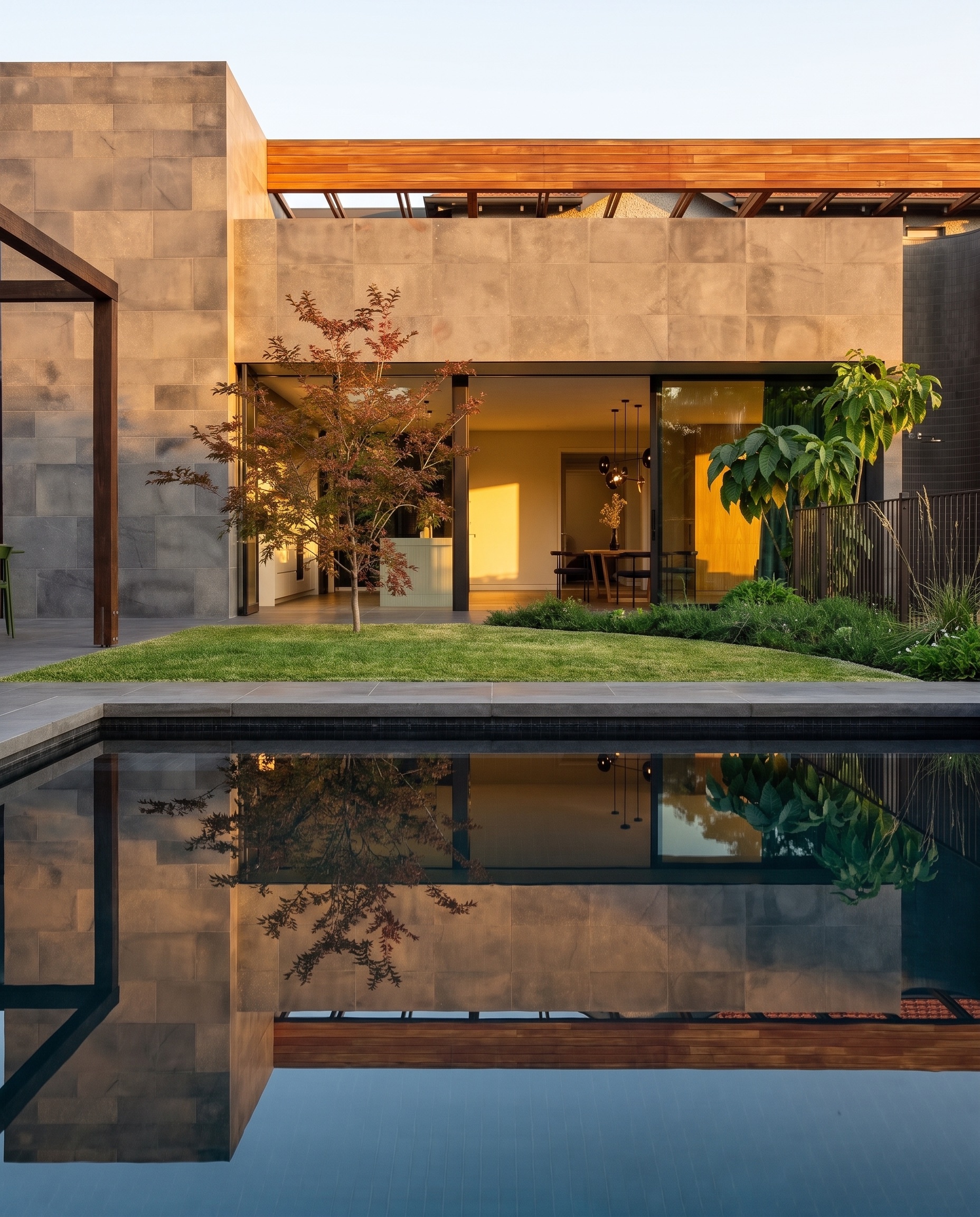
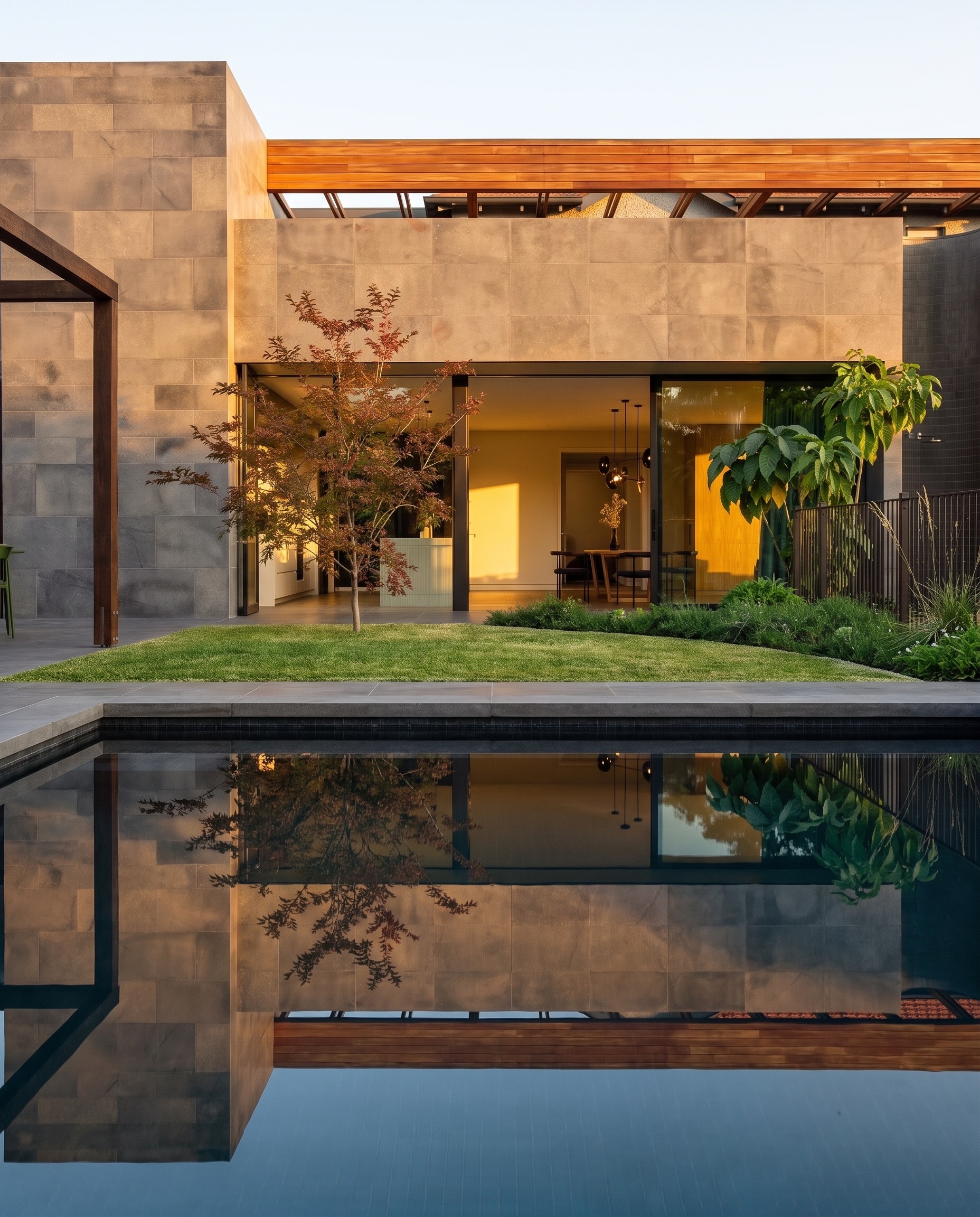
The three original directions
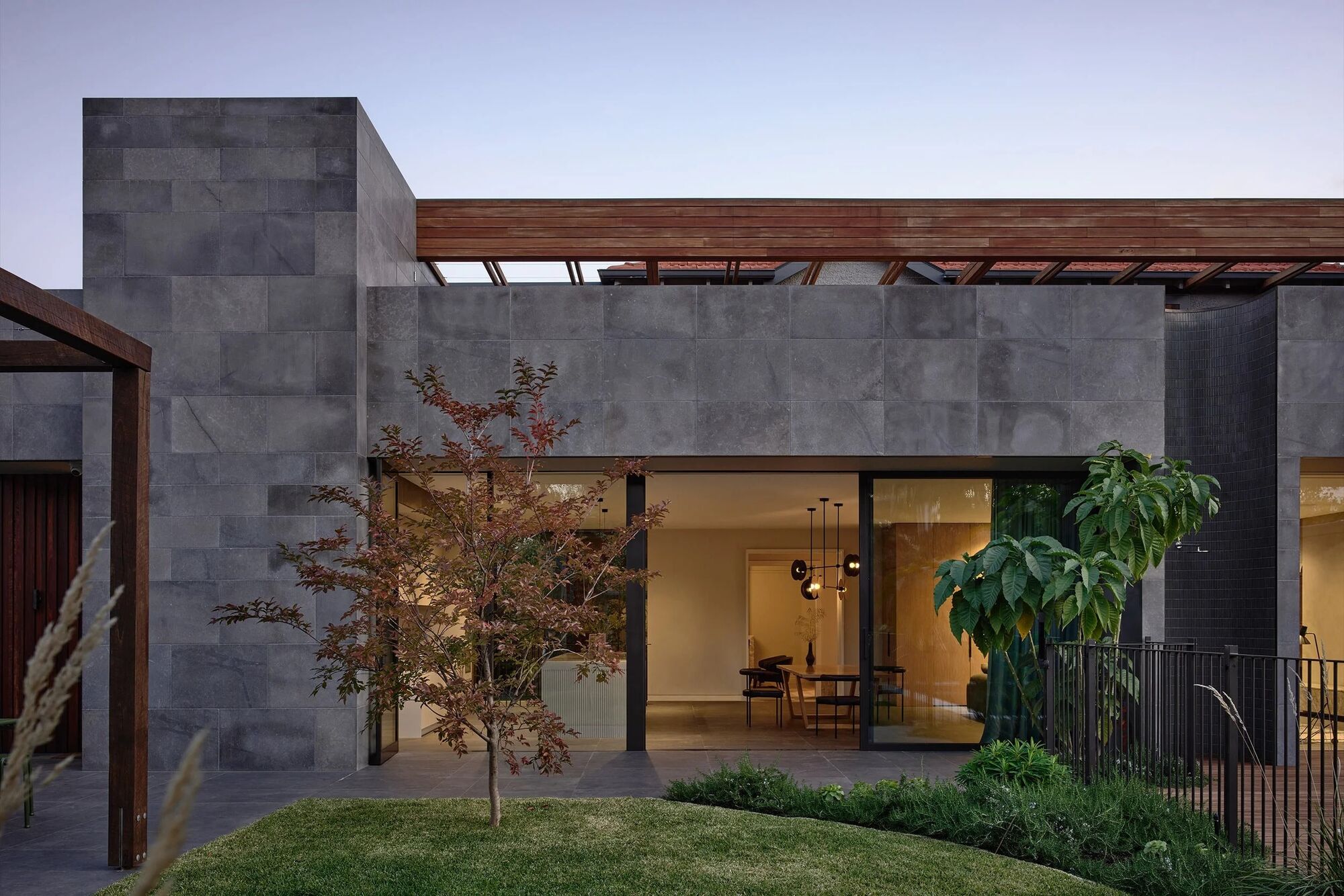
The Folio
The editorial flagship: stacked display type over their photography, a twelve-project index with hover-reveal imagery, architect credits, and the Prolifica philosophy front and centre. Now built out in full above.
Preview 1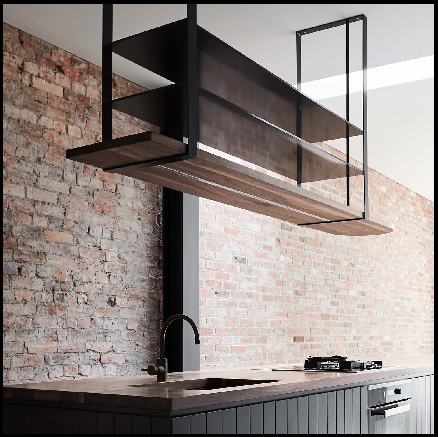
The Atelier
“Every Detail, Considered.” The craft, up close: four intentional decisions told image-by-image, a filmstrip of details from recent commissions — the builder’s own voice, no noise.
Preview 2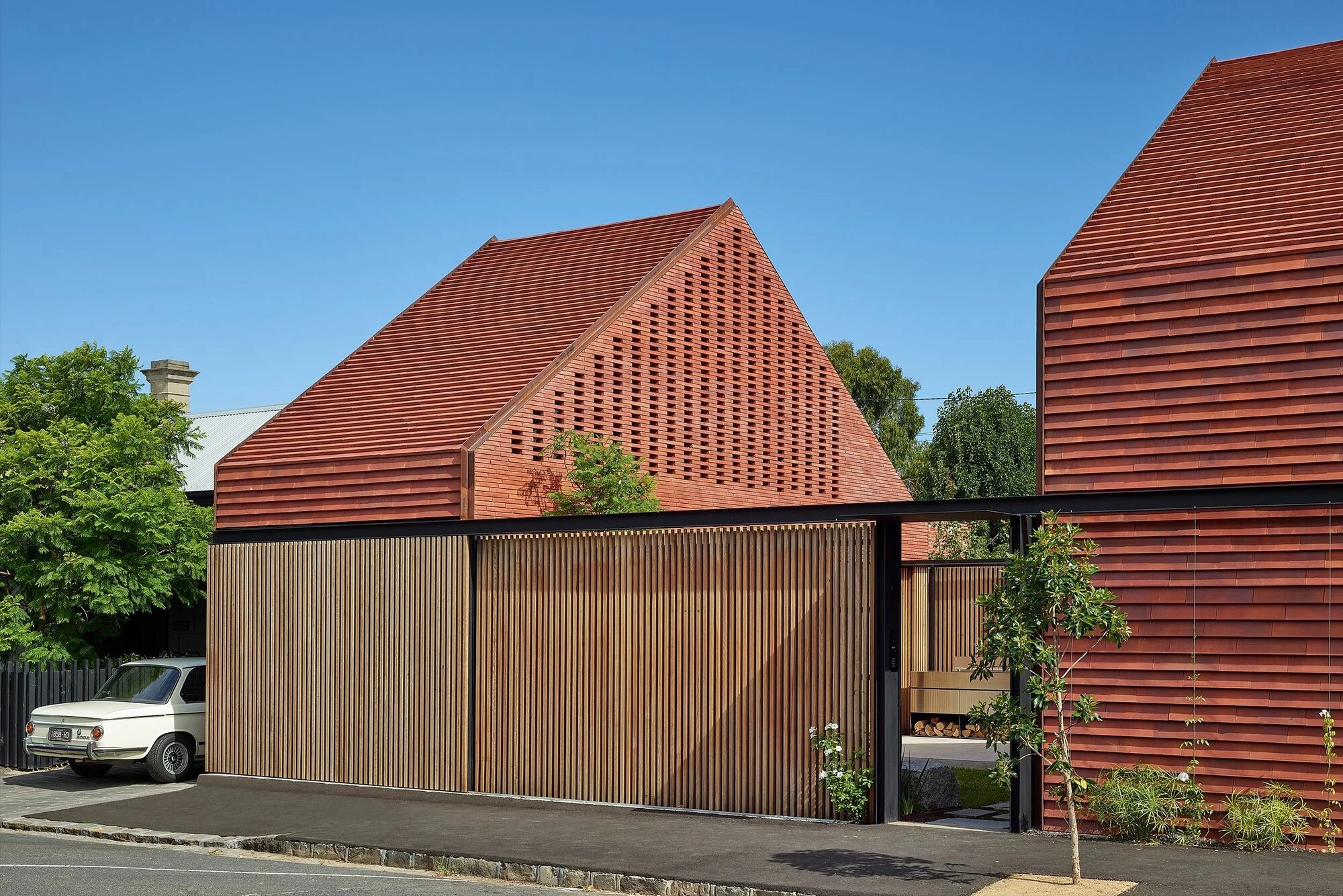
The Commission
A considered filter: a 60-second check on where a project sits — design stage, architect, timeline — before a private conversation with the directors. Few projects, on purpose.
Preview 3Concept mock-ups · real Prolifica photography & copy · all concept sets
